Golf Dashboard
This Power BI dashboard provides a comprehensive view of golf course performance and player activity across different weeks and member types. It visualizes total rounds played, distribution by member category, and daily performance trends to support better operational insights.
Categories
Golf
The BI Soultion:
Key highlights include:
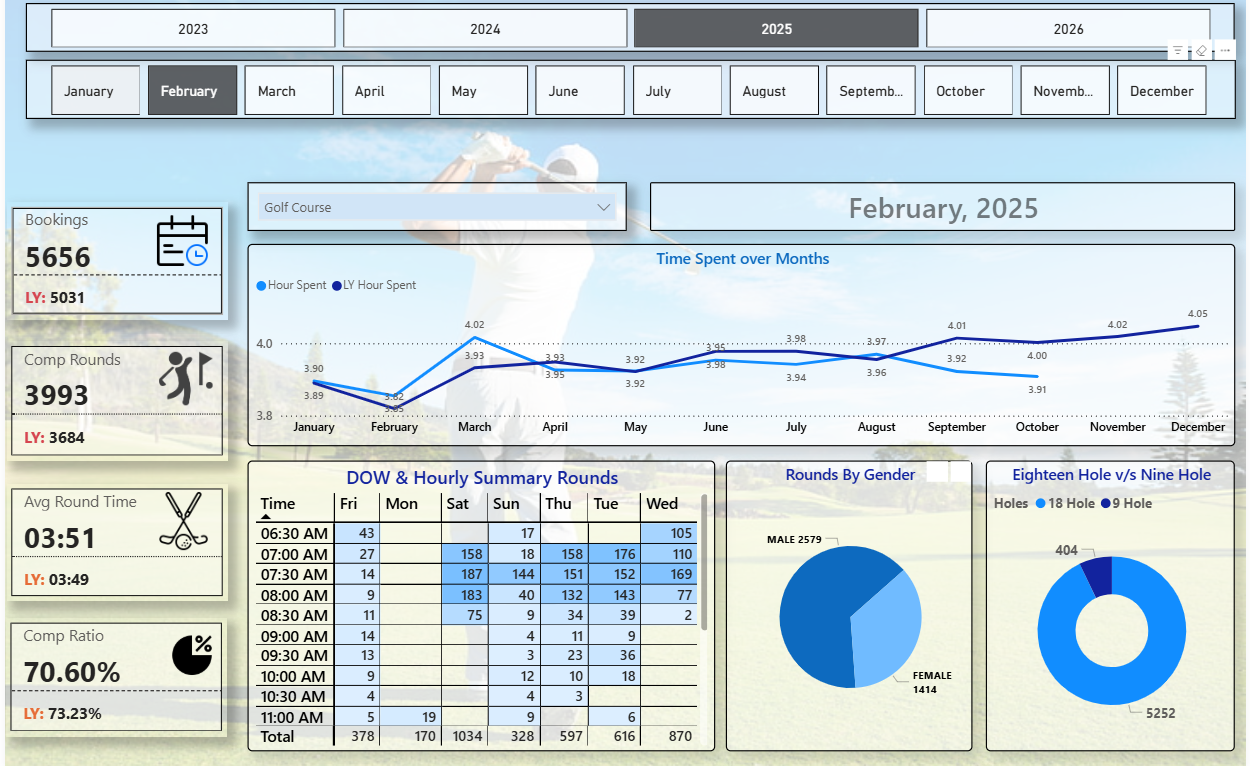
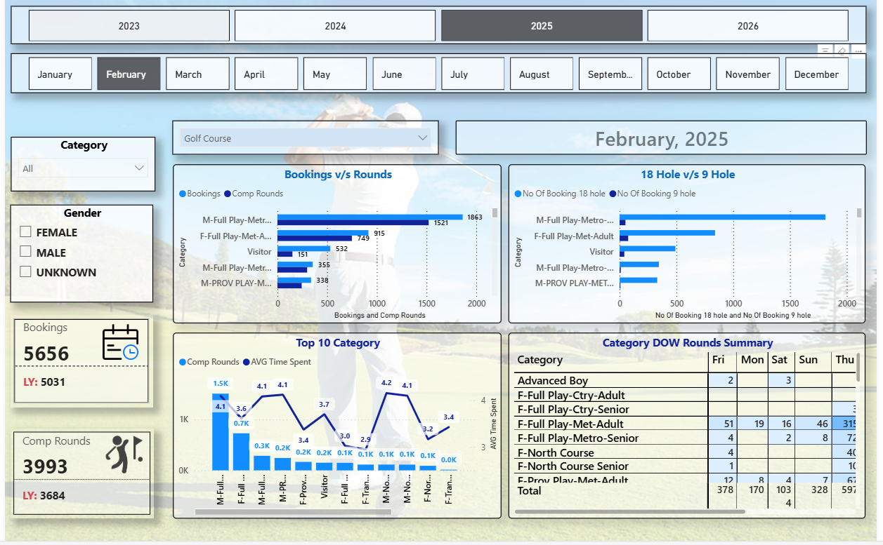
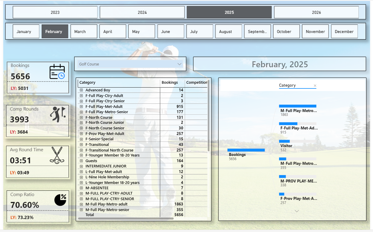
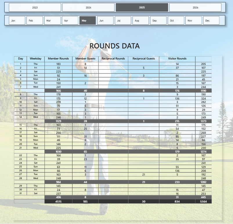
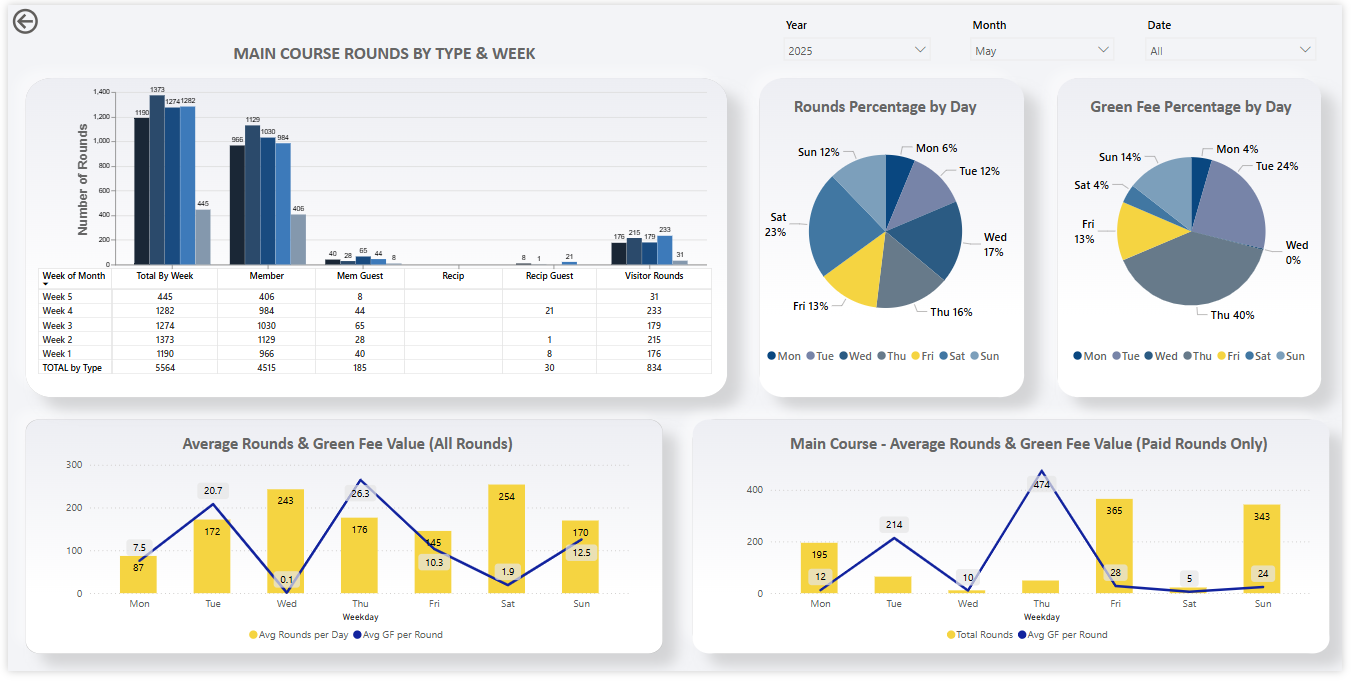
Rounds by Type & Week: Displays total, member, guest, reciprocal, and visitor rounds for each week, helping track participation patterns.
Rounds & Green Fee Percentages by Day: Shows which days of the week drive the highest play and revenue contribution.
Average Rounds & Green Fee Trends: Compares average rounds per day and average green fee values for both all rounds and paid rounds only.
Interactive Filters: Users can filter data by year, month, and date for flexible analysis.
This dashboard enables golf course managers to monitor player activity, identify peak days, and optimize pricing or scheduling strategies based on data-driven insights.
Technical Highlights
Developed using Power BI Desktop with dynamic DAX measures to calculate weekly and daily averages.
Data modeling includes relationship-based filters between fact tables and date dimensions for accurate aggregation.
Utilized switch logic and time intelligence functions (e.g.,
CALCULATE,FILTER,DATESINPERIOD) to ensure context-aware calculations.Custom visuals built using Power BI’s native charting tools with optimized performance and a responsive layout.
Designed with consistent color themes, data labels, and tooltips for clarity and user-friendly navigation.
This dashboard delivers a powerful analytical interface for golf course management, allowing stakeholders to monitor trends, identify peak performance periods, and improve operational efficiency through data visualization.
Lets Work Together
The technological revolution is changing aspect of our lives, and the fabric of society itself. it’s also changing the way we learn and what we learn
