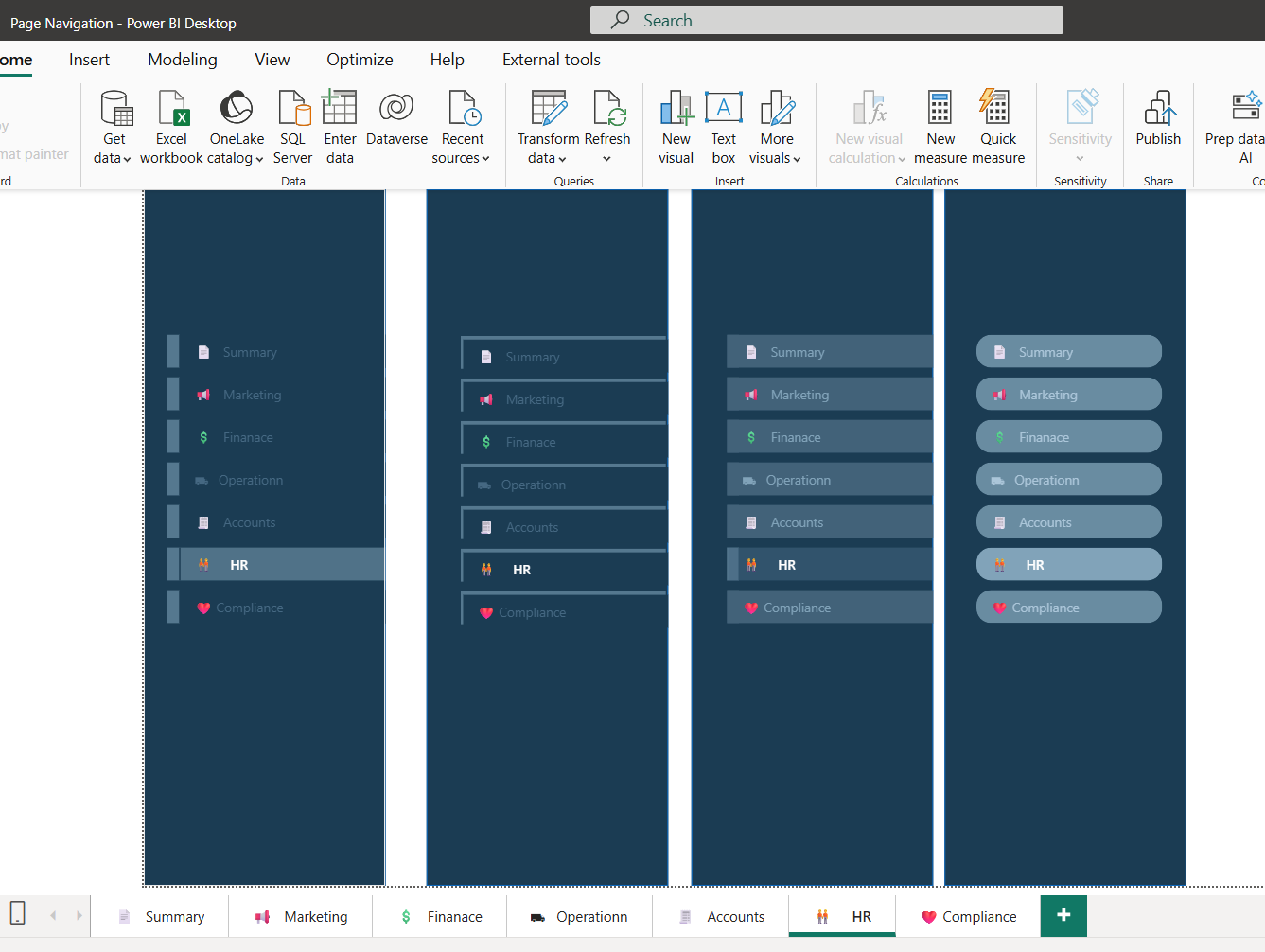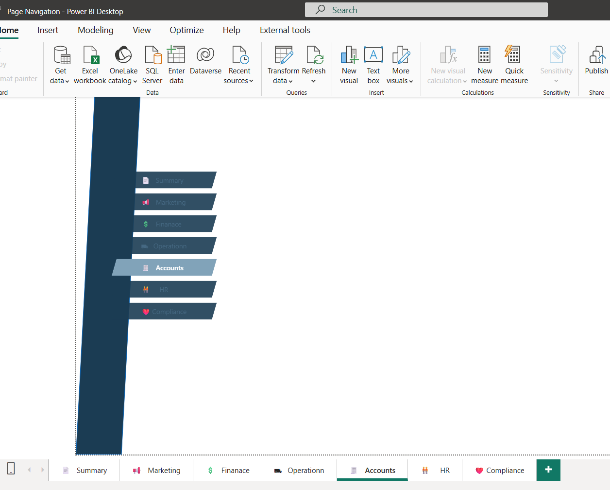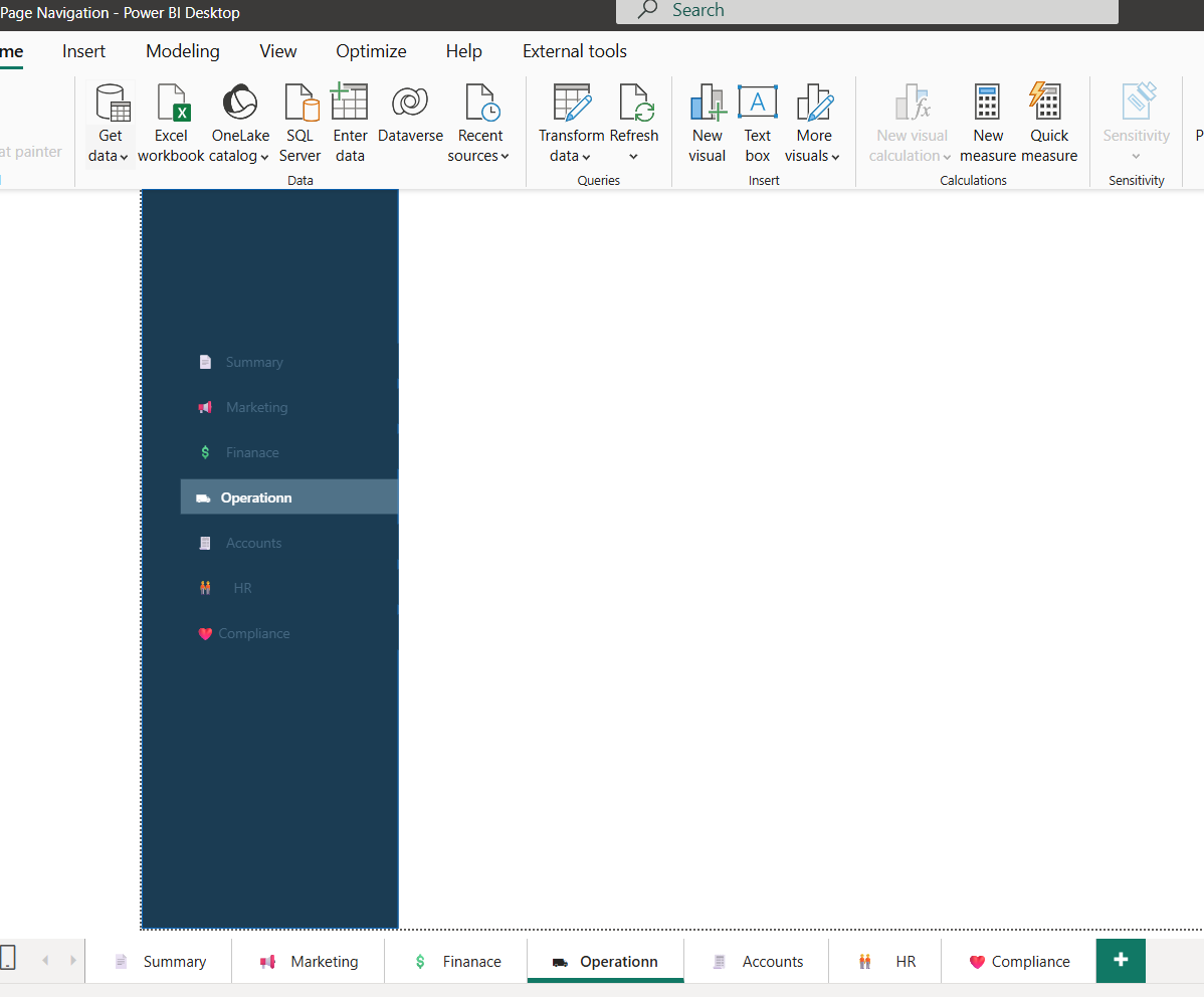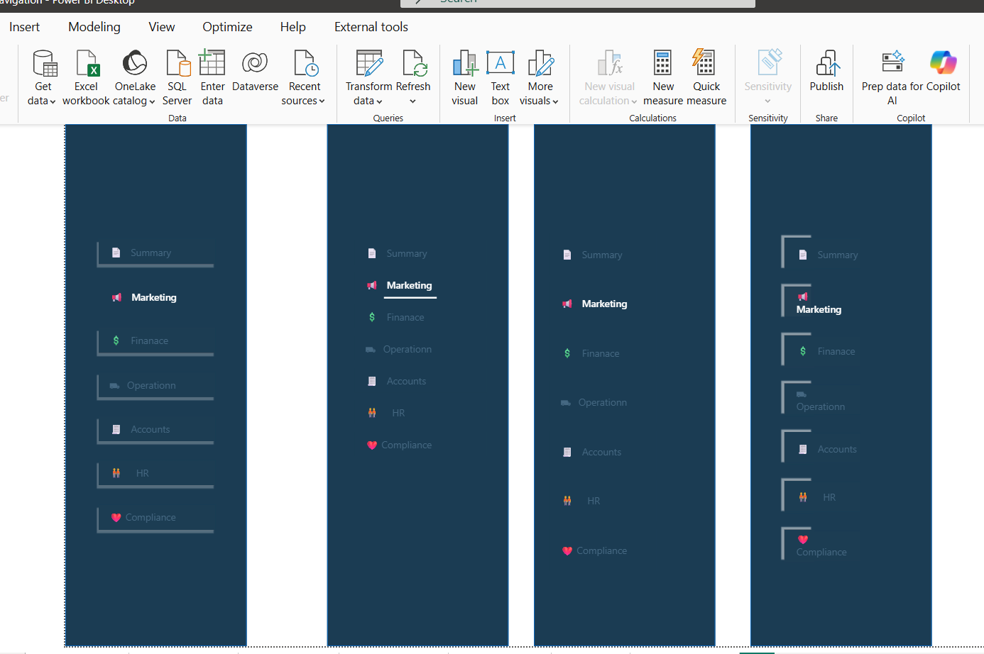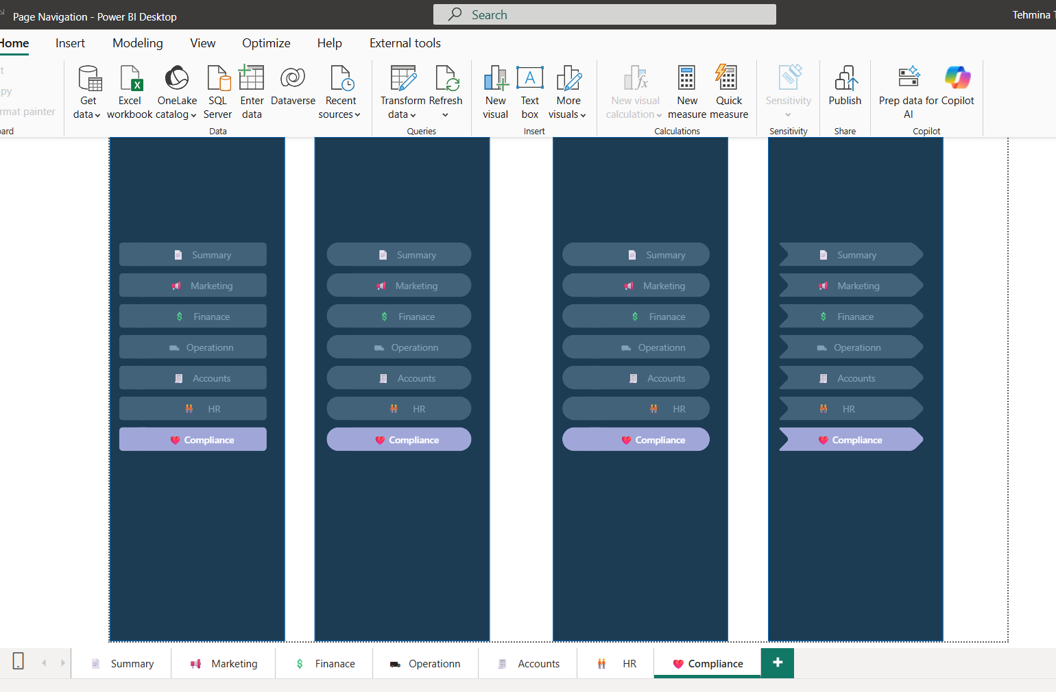
Power BI Page Navigation Design Experiment
This project was a hands-on exploration of Power BI’s navigation and layout design techniques, inspired by Bas Dohmen’s “How to Power BI” tutorial series.
The goal was to refine my UI/UX skills in dashboard design, focusing purely on user flow and visual experience rather than data complexity.
Categories
Design
Key Highlights:
-
Experimented with page navigation buttons, icons, and bookmarks to create a seamless, app-like experience inside Power BI.
-
Designed custom background layouts using PowerPoint, exported as SVGs, and integrated them into Power BI for a clean and modern look.
-
Structured visuals and measures strategically to maintain readability and consistency across multiple pages.
-
Focused on color balance, spacing, and visual hierarchy to improve dashboard usability.
-
Used GPT-generated dummy data to simulate real-world scenarios and test design responsiveness.
This project helped me sharpen my visual storytelling and layout composition skills — learning how small design details can make Power BI reports feel intuitive and professional.
Lets Work Together
The technological revolution is changing aspect of our lives, and the fabric of society itself. it’s also changing the way we learn and what we learn


