Fitness Tracker Dashboard – Personal Health Analytics in Power BI
This project visualizes personal fitness data in a clean, app-style Power BI dashboard.
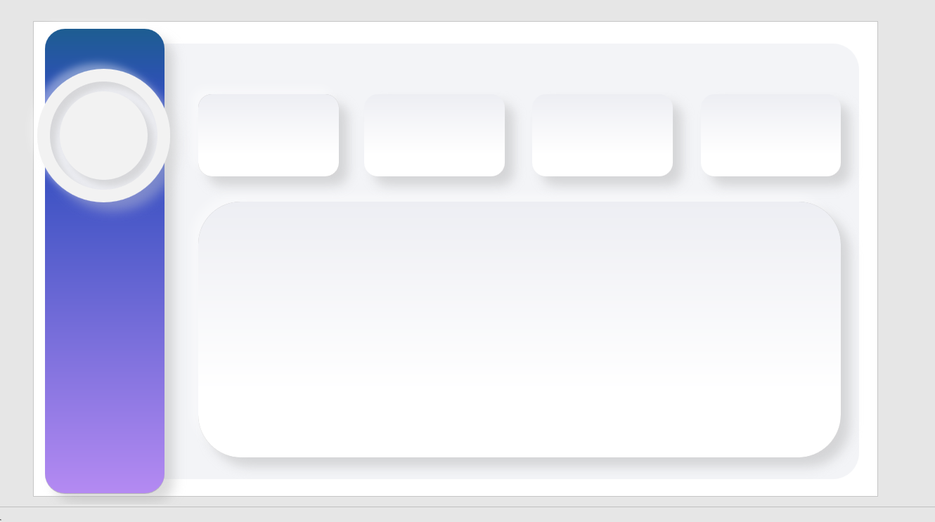
I first designed the layout in PowerPoint using custom SVG graphics, then imported the background into Power BI to align visuals and cards precisely.
The data was AI-generated using GPT for simulation, and I built measures for calories, heart rate, steps, and workout frequency.
The inspiration came from How to Power BI channel , which guided the visual storytelling and layout approach.
The result is a modern, mobile-friendly dashboard that tracks performance trends and health metrics interactively.
Categories
Health & Fitness
Introduction:
This dashboard was designed to help users monitor their overall fitness progress by visualizing daily activity, calories, heart rate, and workout sessions in one unified view. The goal was to transform raw fitness tracking data into a meaningful, interactive experience that highlights key health metrics and trends.
Problem:
Fitness data was stored across multiple tracking devices and apps, making it difficult to view consolidated insights. Users couldn’t easily identify patterns in their daily habits or track how consistent they were over time.
Solution
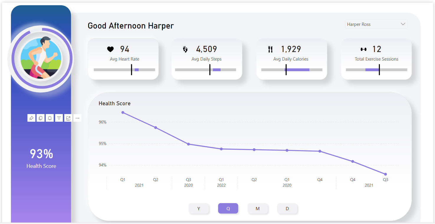
I developed an interactive Power BI dashboard that integrates all essential metrics — including heart rate, steps, calories burned, and exercise frequency — into a single, visually engaging view. The dashboard features a personalized greeting, performance indicators, and a dynamic trend analysis chart.
Key Features
Dynamic User Selection: Filter insights by user name for personalized tracking.
Performance KPIs: Key metrics such as Avg Heart Rate, Avg Daily Steps, Calories Burned, and Exercise Sessions are displayed using custom visuals for clarity.
Health Score Trend: A smooth line chart tracks changes in the user’s overall health score across different time periods (daily, monthly, quarterly, yearly).
Custom Visuals: Implemented gradient-based visuals and progress indicators for a clean, app-like interface.
Responsive Design: Optimized layout for both desktop and mobile viewing in Power BI Service.
Impact
This dashboard empowers users to see how their lifestyle choices affect their health over time. It turns scattered data into actionable insights, motivating consistent activity and better fitness habits.
Lets Work Together
The technological revolution is changing aspect of our lives, and the fabric of society itself. it’s also changing the way we learn and what we learn


